The Handshake Before the Sentence: Auditioning Typefaces for British Brands
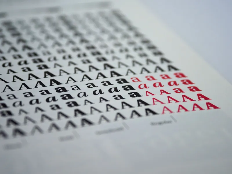
Typography is the bit of your brand that speaks before your copy clears its throat. A customer meets the letterforms first — on the app, the van, the laminated sign by the till — and makes a judgement about who you are before they have read a word. In the UK, that judgement is often: another one of those. Not because the words are bad. Because the typeface has already blended into the queue.
The handshake before the sentence
Most British brands reach for the same sensible grotesque. You know the one: clean, neutral, slightly international, the navy blazer of typography. It says competent. It says we have a legal team. It says nothing much else. The problem is not that it is ugly. It is that it is everywhere. The safe grotesque is the most crowded room in the country. Everyone is wearing the same jacket and hoping to be remembered.
That is the quiet trap. A typeface is not a neutral delivery vehicle for words. It is a costume. It tells people how to hear the sentence before the sentence arrives. A refund email set in a severe, wide-tracked grotesque sounds like a policy. The same words in a rounded, slightly Comic-adjacent face sound like an apology from a mate who has lost your parcel behind the sofa. Neither is automatically right. But one of them is doing more work than the other, and you should know which.
What the odd choices actually say
Type is a costume, and British audiences are fluent in reading it, even if they could not name the font. A rounded, Comic-adjacent face can be disarming. It says we are human, we are approachable, we are not going to make you hold for forty minutes. But it can also read as a children's party invitation when you are explaining a delay to a train full of commuters. Warmth has a shelf life. Use it on the wrong sentence and it turns into a smirk.
Condensed type has a different accent. It is urgent, editorial, a bit wide-boy poster. It says we are direct, we are no-nonsense, we have probably shouted at a supplier. That can be refreshing on a value brand or a campaign that needs momentum. It can also make a customer service message feel like a warning sign on a motorway.
Humanist sans-serifs are the quiet overachievers. They feel warm, literate, slightly bookish, the typographic equivalent of a good independent bookshop that also sells coffee. They can carry dry British humour without winking. High-contrast serifs bring heritage and confidence, but they can turn brittle when the news is bad. None of these choices are good or bad in isolation. They are only good or bad for the sentence they are standing next to.
The complaint test
Here is a cheap audition that will teach you more than a mood board. Take your worst customer complaint — the one about the missing delivery, the broken hinge, the refund that went to the wrong account — and set it in each typeface on your shortlist. Same words, same layout, same size. Then read it out loud.
A chirpy rounded font can make 'Sorry for the delay to your refund' sound sarcastic. A condensed all-caps setting can make it sound like a shout. A serene grotesque can make it sound like a press release from a company that has never met a person. The test is not whether the typeface looks nice. It is whether it can hold bad news without smirking, shouting or shrugging.
Do it at 9am and again at 9pm. Read it on a phone, because that is where most of your customers will meet it. Read it on a printed delivery note, because that is where it will be rained on. If the typeface only works when the sentence is cheerful, it is not a brand typeface. It is a party trick.
The British irony problem
British brands often write with a dry, self-deprecating edge. That is a national sport, and it is hard to set. A jaunty font turns irony into a wink. A severe grotesque turns it into a shrug. The best type for British dryness is usually one that can be warm without being jolly and direct without being aggressive. It needs a straight face. It needs to let the joke land without nudging the reader in the ribs.
This is where the safe grotesque lets you down in a different way. It does not make the irony sharper. It makes it sound like everyone else's irony. The customer cannot tell whether the dry line is yours or a template. In a crowded market, that is a costly kind of anonymity.
Audition, don't rebrand
You do not need a full rebrand to test this. Shortlist three typefaces. Set the same complaint, the same error message, the same click-and-collect sign and the same refund email in each. Then ask a few staff and a few customers a better question than 'Which do you like?' Ask: 'Which one would you trust to tell you bad news?'
Check the boring bits, too. Numerals. Punctuation. The lowercase g. The ampersand. The way it sets a price, a postcode and a phone number. A typeface can look lovely in a headline and fall apart in a table. Test it at small sizes on a phone and at distance on a van. Test it in grey weather. If it only works in a pitch deck, it is not a brand typeface. It is a prop.
Keep one workhorse and one oddball
Most brands need a workhorse and a wink. A workhorse for the 90% of the job that is forms, labels, receipts and legal small print. An oddball for the moments where personality earns its keep: a campaign line, a seasonal drop, a sign that has to make someone smile in a car park. Do not buy five. Five is a sample sale, not a system.
The Blue Lemons-ish lesson is that unexpected is not the same as novelty. A typeface can be odd and still have a spine. The point is not to be weird for the sake of it. The point is to be recognisable before you have said anything clever. Your typeface is already talking behind your back. Make it say something you would sign your name to. Then read the worst complaint again.