The Brand Is in the Hold Music: Designing Waits People Forgive
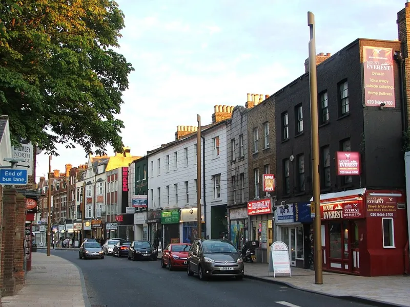
Photo: Chris Whippet , CC BY-SA 2.0, via Wikimedia Commons
Nobody puts a queue on the mood board. It doesn’t sit comfortably next to the typeface and the tone-of-voice deck. But for most UK customers, the queue is the brand. It’s the bit they remember, the bit they describe to a friend, and the bit that quietly decides whether the campaign was true.
You can promise warmth, speed and humanity in a 30-second film. Then someone rings your call centre on a wet Tuesday in November and hears 27 minutes of tinny hold music. That’s not a customer service issue. That’s a brand strategy issue wearing a headset.
The campaign nobody briefed
A queue is a strange piece of theatre. It has an entrance, a middle and an exit. It has rules, rituals and a cast of people pretending not to look at each other. On the high street, it can be a rope barrier outside a bakery or a scrum at a till. Online, it’s a spinning loader or a virtual waiting room for gig tickets. In delivery, it’s a tracking page that says ‘out for delivery’ with the confidence of a weather presenter.
All of that is designed, even when nobody designed it. The question is whether it was designed on purpose.
Most brands pour their energy into the first impression and the last excuse. The queue sits in the middle, unloved, doing more persuasive work than the billboard. If your campaign says ‘we’re straightforward’, a queue that snakes past three staff doing nothing says something else entirely.
Fairness beats speed
Speed is lovely, but fairness is what people actually judge. A short wait that feels rigged is worse than a longer wait that feels just. We’ll tolerate a queue at the post office if it’s moving and nobody is clearly jumping it. We’ll rage at a checkout that lets one lane appear to move twice as fast for no reason.
This is why the humble ‘number of people ahead of you’ message works. It’s not charming. It’s honest. It tells people the system knows they exist. The same goes for a call centre queue that tells you where you are, rather than leaving you to wonder whether you’ve been forgotten in a digital cupboard.
Fairness also means not hiding the awkward bits. If a delivery is delayed, say so before the customer has to ask. If a shop is short-staffed, put a human on the door with an explanation. ‘We’re a bit behind, sorry’ is not a brand disaster. Silence, followed by a generic apology email, is.
Show the workings
People forgive a wait they understand. They resent a wait that feels like a riddle. So show the workings. Explain why the queue exists, what’s happening, and what happens next. Not in corporate fog, but in plain English.
A few examples that cost almost nothing:
- A café with a chalkboard: ‘Three staff down. Queues longer than usual. Free refills for anyone who waits more than ten minutes.’
- A parcel tracking page that says ‘Your driver is on stop 14 of 22’ instead of ‘in transit’.
- A call centre that offers a callback with a real time window, not a vague ‘as soon as possible’ that means ‘we’ll forget’.
- A checkout that says ‘This is a big order, so it’s taking a moment’ rather than freezing into a white screen of doom.
These are tiny pieces of copy. They’re also campaign assets. They tell the customer what kind of organisation they’re dealing with: one that notices.
Give the wait a shape
A shapeless wait feels endless. A shaped wait feels like a journey. That might mean progress bars, countdowns, numbered tickets, or a simple sign that says ‘we’re currently serving number 42’. It might mean splitting a long process into stages so people can see they’ve moved. It might mean giving people something useful to do while they wait, like filling in a form before they reach the desk or reading a genuinely helpful guide rather than a wall of terms and conditions.
The shape doesn’t have to be slick. In fact, a bit of rough honesty often works better. A handwritten sign beats a polished screen that says nothing. A staff member saying ‘you’re next but one’ beats an automated voice that sounds like it’s reading a ransom note.
The point is agency. A wait with no information makes people feel trapped. A wait with a shape gives them a small sense of control. That’s a brand feeling you can’t fake with a logo.
Design the exit, not just the entrance
The end of a queue matters more than most brands admit. If the payoff is good, people forgive the wait. If the payoff is a shrug, the wait becomes the story. So design the handover. Make the last step clear. Thank people properly. Don’t let the queue end with a printer jam and a member of staff saying ‘next’ without looking up.
This is where a bit of Blue Lemons thinking helps. The queue is not a gap between the campaign and the customer. It is the campaign. It’s the moment your brand either keeps its promises or quietly breaks them. You don’t need a bigger budget. You need someone to own the wait, map it, and treat it as part of the experience rather than an unfortunate side effect of having customers.
A distinctive wait is still a wait
There’s a temptation to make a queue ‘fun’ — quizzes, screens, branded hold music with a saxophone solo. Be careful. People don’t want to be entertained in a queue. They want to be respected in a queue. Charm is fine, but only after the basics: fair rules, clear information and a visible end point.
If you can make the wait feel like your brand without making it longer, better. A friendly voice note from a delivery driver. A shop sign that uses your tone without wasting anyone’s time. A callback option that actually calls back. These are small, human touches that stick.
Before the next busy Monday, pick one queue your customers endure. Walk it yourself. Time it. Read the signs. Listen to the hold music. Then ask the uncomfortable question: if this wait were the only campaign we ever ran, would anyone believe the brand we say we are?
If the answer is no, you’ve found a cheaper, more useful brief than any rebrand.