The Corkboard Brief: How to Win a Neighbourhood One A5 at a Time
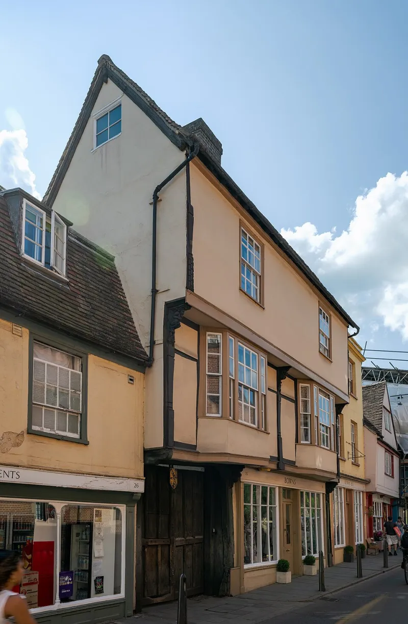
Photo: Tilman2007, CC BY-SA 4.0, via Wikimedia Commons
There is a noticeboard in a post office in a town you have never visited. It is behind the queue, next to a poster about parcel collection and a card advertising a lost cat. It is the most honest media channel in Britain. No ad blocker, no skip button, no attribution dashboard. Just a rectangle of cork, a sheet of A5, and a two-second glance from someone who mostly wants to be somewhere else.
Most brand teams would not call this a campaign. They should. The noticeboard is a brutal editor: it removes everything that does not earn its place. What survives is a useful lesson in local persuasion — not because it is charming, but because it is constrained.
The least scalable channel is the most persuasive
National campaigns often get localised by changing the postcode on a landing page. The noticeboard does the opposite. It starts with one street, one audience and one reason to act. That is not a limitation; it is the strategy.
The board does not care about your tone of voice guidelines. It cares whether a person in a hurry can work out what you want them to do before the queue moves. If your A5 needs a paragraph to make sense, it is a leaflet, not a notice. If it needs a QR code and a five-second explanation, it is a website with a pin through it.
This is the first brief: make the constraint do the work. One audience. One action. One reason to act now.
Hierarchy is survival
On a noticeboard, the headline is not a creative flourish. It is a filter. It has to stop the right person and let everyone else walk past. That is a useful test for any campaign headline: does it repel the wrong reader as clearly as it attracts the right one?
The second line does the practical work — what, where, when, how much. The body copy, if there is any, exists only to remove a reason to say no. 'Wednesdays at the lido, 7pm, bring a towel' beats 'a weekly wellbeing experience designed to unlock community connection'. One is a notice. The other is a brand deck that got wet.
Good hierarchy is not about making things small. It is about deciding what matters first. Most local campaigns fail because everything is trying to be first at once.
The tear-off tab is a tiny contract
The tear-off tab is the most underrated piece of campaign mechanics in Britain. It is not just a convenience. It is a promise: take this, and you are halfway to doing the thing. It also happens to be a measurement system that never needs a cookie banner.
A tab should carry the offer, not the brand name. If someone rips off a strip that says 'free first class' or 'Saturday repair drop-in', they have taken a piece of the campaign into their pocket. If it says your logo and nothing else, they have taken a souvenir.
The physical detail matters. A tab that tears raggedly is a brand that did not finish the job. Card stock, not laminated — laminating kills the rip. A clean tear is a small act of respect for the person doing it. That sounds fussy. It is also the difference between a notice that gets used and one that gets admired from a distance.
Local specificity beats cleverness
National brands often treat local detail as decoration. On a noticeboard, it is the whole argument. 'The 08:14 from Platform 2' is more persuasive than 'your daily commute'. 'The car park behind the Co-op' is better than 'central location'. 'Bring a coat, we are outside' is better than 'all-weather fun'.
Specificity does two jobs. It proves you are actually here, not just targeting here. And it gives the reader a mental picture they can check against their own knowledge. If the picture is wrong, they dismiss you. If it is right, they trust the rest.
This is where a lot of local campaigns go soft. They use the word 'community' as a shortcut and hope nobody asks which community. The noticeboard does not let you get away with it. Name the road. Name the school. Name the thing that happens on a Tuesday.
Useful beats clever
A dog-walking rota is a better campaign than a slogan about neighbourliness. A repair café is a better campaign than a manifesto about sustainability. The noticeboard is full of offers that are genuinely useful, and that is why people read it. They are not there for your brand story. They are there for a thing that might help.
This does not mean every brand needs to offer a free service. It means the campaign needs a clear, practical reason to act. A deadline. A lift. A small saving. A chance to complain to someone who will actually listen. Usefulness is not a tone. It is a structure.
A brief you can pin up
Here is the corkboard brief, translated for a brand team:
- One reader, one action. Write the reader as a sentence: 'the parent doing the school run who has forgotten World Book Day'. Then write the action: 'collect a free costume rail token before Friday'.
- Headline under eight words. If it needs a comma and a colon, it is not a headline. It is a paragraph wearing a hat.
- Make the tab line the offer. Not the logo. Not the hashtag. The thing they get for ripping it off.
- Use local nouns. Streets, landmarks, times, weather. If the notice could work in any town, it is not local yet.
- Print for the weather. Drizzle, sun-fade and a hundred thumbs. 160gsm minimum, matte, no lamination where tabs are cut.
- Place it at queue height. Eye level for someone waiting, not someone walking past. Ask the postmaster where the regulars actually look.
- Refresh every ten days. A curled corner and a faded date tell people the campaign is over, even if it is not.
Measure the rip, not the impression
You do not need a dashboard for this. Count the tabs. Note which corner goes first. Ask the staff what people say when they take one. Put two versions on two boards and compare. A tab count is a focus group with better attendance and no biscuits.
The noticeboard will never scale. That is the point. It is a reminder that persuasion is often local, physical and slightly awkward. Your brand does not need another billboard to be noticed in a neighbourhood. It needs one street to vouch for it, one useful offer, and one sheet of card that survives the rain.
Blue Lemons believes in standing out by standing still — on a corkboard, in a queue, in a town you have never visited. That is where the real brief is pinned.